Product · Brand · Strategy
An old map
gets a new face.
Blending cartographic principles and savvy design to create a new digital map experience for 30 million monthly users.


Product · Brand · Strategy
Blending cartographic principles and savvy design to create a new digital map experience for 30 million monthly users.
The Problem:
How do we modernize and improve the core map experience for MapQuest users following Verizon's acquisition, addressing legibility issues with roads, unclear labels, and confusing land use indicators?
The Solution:
Create a comprehensive redesign of the map style by applying cartographic expertise, implementing a strategic design process, and developing a new visual system that enhances user experience and strengthens MapQuest's position within Verizon Location Services.
Key Components:
Strategic Research & User Insight Analysis – Reviewed user feedback, conducted benchmark testing, and validated pain points to establish tangible metrics for improvement in map legibility and functionality.
Cartographic Expertise Integration – Hired a specialized cartographer and cross-trained her in UX/UI to bridge traditional mapping principles with modern digital needs.
Competitive Analysis & Visual Direction – Created mood boards and analyzed competitor products to determine a distinct yet user-friendly visual direction for the new map style.
Hierarchical Visual System Development – Designed a new color palette utilizing brightness and saturation for clearer hierarchy, created parallel connections between map shapes and real-life objects, and built a cohesive system of iconography.
Multi-Platform Implementation – Executed the redesign across both mobile applications and the desktop experience, including the complex technical transition from raster to vector mapping.

Before and After

Before and After Night Mode

New Map Style Inside MapQuest Interface

New Map in Use, Boston MA

New Night Mode Map in Use, Boston MA

New Map in Use, Boulder CO (shows new iconography)
The work behind the work.

Original MapQuest Map

Results from the Benchmark Test on the Original Map

User Feedback on Original Map

Moodbaord

Competitive Analysis

Cartographic Principals Applied

Cartographic Color System

Route Ribbon
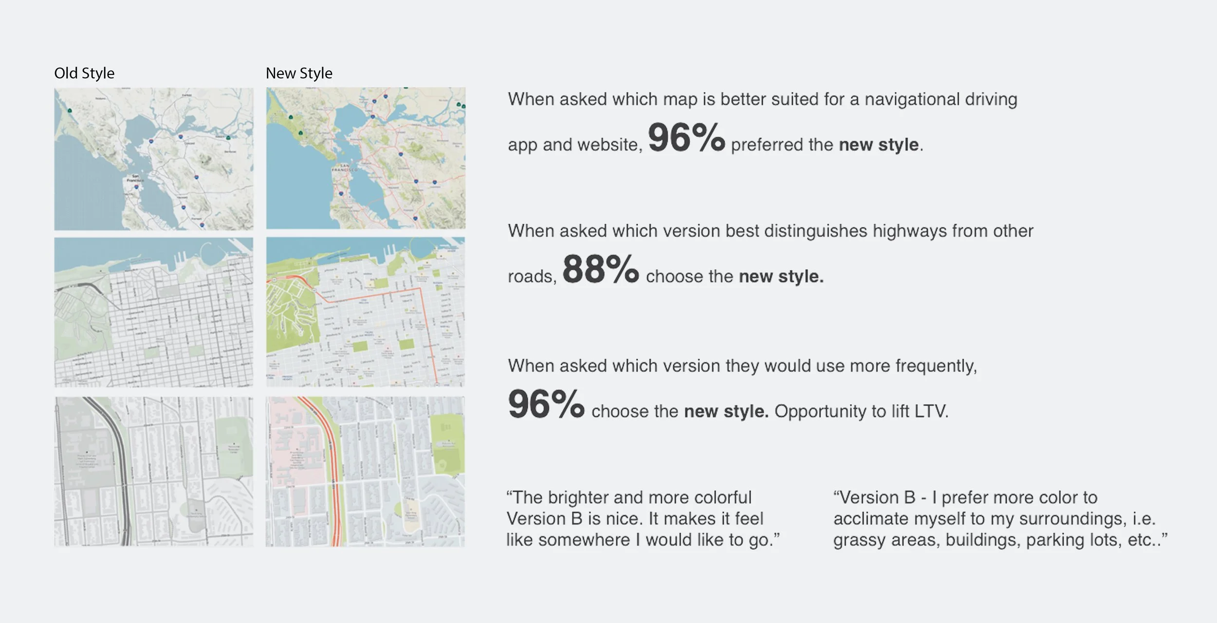
Successful Test Results on the New Map Style
The Results:
Enhanced User Experience – Dramatically improved map legibility with clearer labels, more identifiable highways, and better differentiation of green spaces from urban landscapes.
Successful Stakeholder Adoption – Secured buy-in from Verizon executives through objective design processes, competitive analysis, and compelling user testing results.
Phased Implementation Strategy – Strategically launched on mobile platforms first while tackling the more complex desktop vector map transition.
Large-Scale User Impact – Successfully deployed the most significant product update in half a decade, positively affecting over 30 million monthly users.
Cross-Disciplinary Skills Development – Created lasting organizational value by cross-training team members in complementary skills (cartography and UX/UI), leading to enhanced career opportunities.